How is it that some people just seem to have a knack for interior design? What separates the professional interior designers from us mere mortals?
If you’re looking to give your home a makeover or you want to do your new extension justice, it’s time we let you in on a little industry secret: colour theory!
What is colour theory?
Okay, we said this was a secret but in fact, a lot of different industries know and use colour theory day to day, from artists to fashion designers. Why? It’s because colour theory is the science of combining colours.
In order to understand and use colour theory, you’ll need to grab yourself a colour wheel. You may remember seeing these back in school.
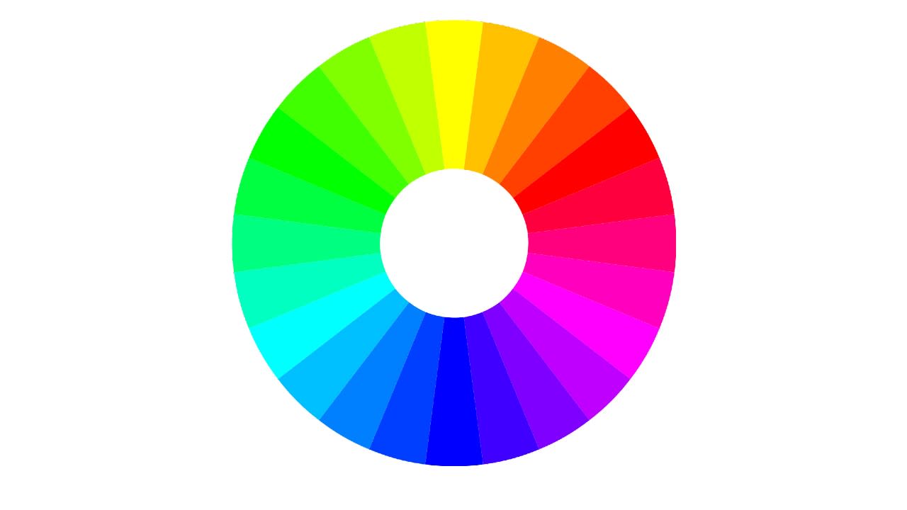
By using this colour wheel, you’ll be able to understand the relationship between various colours and which ones look good together. When two (or three) colours match up well together, it’s known as ‘a colour harmony’.
The purpose of colour theory is to provide practical ways of finding these colour harmonies through the use of the wheel.
Complementary
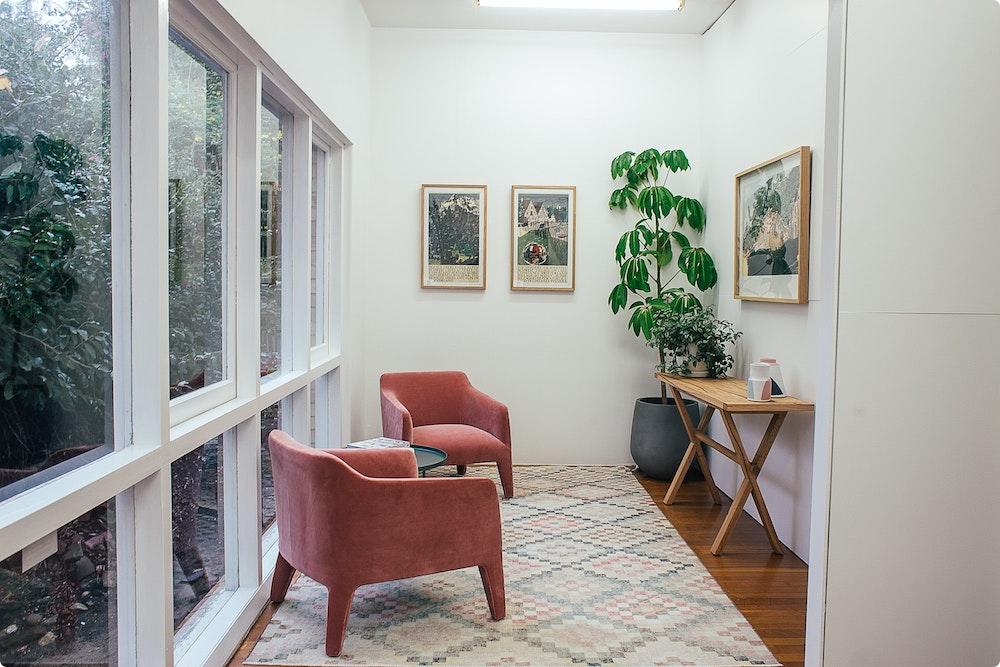
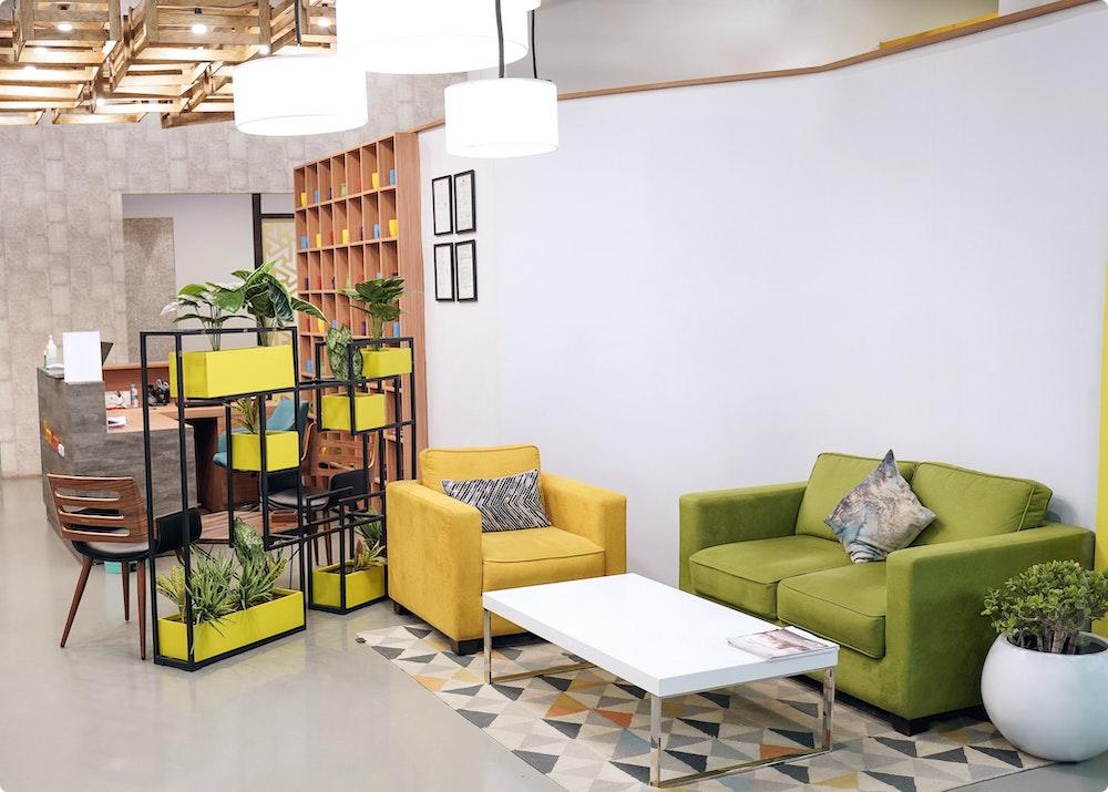
The first way to find a pairing is to use complementary colours. These are two different colours which sit opposite each other on the wheel, such as pink and green or orange and blue.
You might choose to pair a bold wall colour with complementary coloured furnishings, or start with a neutral base and add your two colours in as opposing accents in the room.
This is one of the easiest ways to use colour theory and a good starting place for anyone who’s just starting to play around with colour in their home.
Monochromatic
The idea of monochrome has become synonymous with black and white interiors, but in reality, the term refers to just one single colour.
To start with, you’ll need to select a base colour from the wheel. Once you’ve done this, you can then start exploring the various shades, tints, and tones which sit within.
Shade: adding black to a base hue, darkening the colour.
Tints: adding white to a base hue, lightening the colour.
Tones: combining black and white—or grey—with a base hue.
Monochromatic is a great colour scheme for anyone who’s looking for a subtle yet stylish look to their home.
Analogous
While the name may sound confusing, the way it works isn’t.
Analogous schemes take three colours which sit next to each other on the wheel. Doesn’t matter from where, just as long as all three are together.
You may find that these pairings can become a little overwhelming if you give all three colours the same amount of space in a room. To avoid this, it’s best to pick one colour to be the feature piece and have the others as accents in your design.
Triadic
They don’t call it tri-adic for nothing. It relies on you selecting three colours that sit as a triangle on the wheel. If you’re having trouble finding them, just remember to leave even spacing between them.
We love this scheme because of the bold colour palettes it creates but the results won’t be for everyone. For a softer look, try this out using pastel shades to tone down the high contrast in the colours.
Tetradic
Similar to triadic, tetradic has you use four colours that sit evenly spaced on the wheel. It can be a less intense way of playing with multiple colours, as they sit closer together on the wheel than with triadic, and so the contrast isn’t as high.
However, four colours is a lot. It can be easy for this to slip into an overly busy and messy look. To avoid too much chaos in your interior design, pick one colour to act as the star and then throw in little pops from the other three.
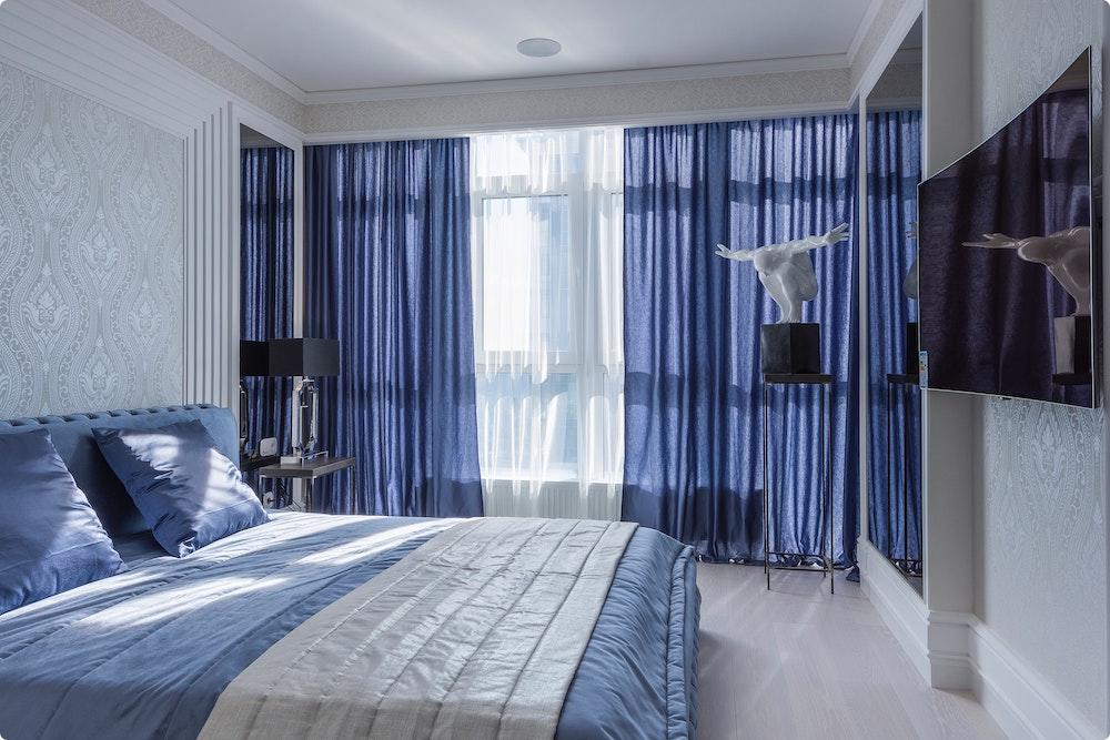
- The reason colour theory works so well is that it often brings into balance both cool and warm colours. When picking out a scheme for your home, remember what connotations both cool and warm bring and how they can best suit different rooms. Warm colours in the living room can help promote socialising, while cool tones in the bedroom can bring a sense of calm.
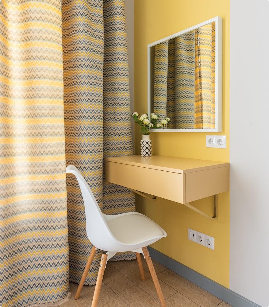
- You don’t have the take colour theory literally to get great results. Rather than just focusing on just blocks of colours, look at everyday items and what shades they bring. For instance, blue and orange have colour harmony and is the reason leather looks so good with blue walls. The orange hue of the fabric matches the block colour but in a pleasingly subtle way.
- Adding colour to your home doesn’t always have to mean painting your walls. You can also achieve a bright, vibrant interior with white walls as a neutral canvas for bold furnishings.
Want to learn more about unlocking your home’s potential? If your home makeover involves renovating, converting, or extending, our experts are always on hand to provide free consultations. Books yours here.